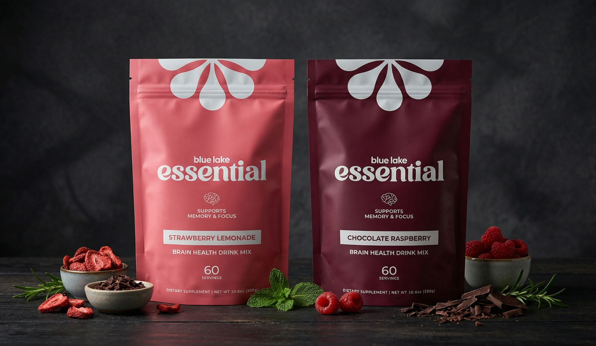
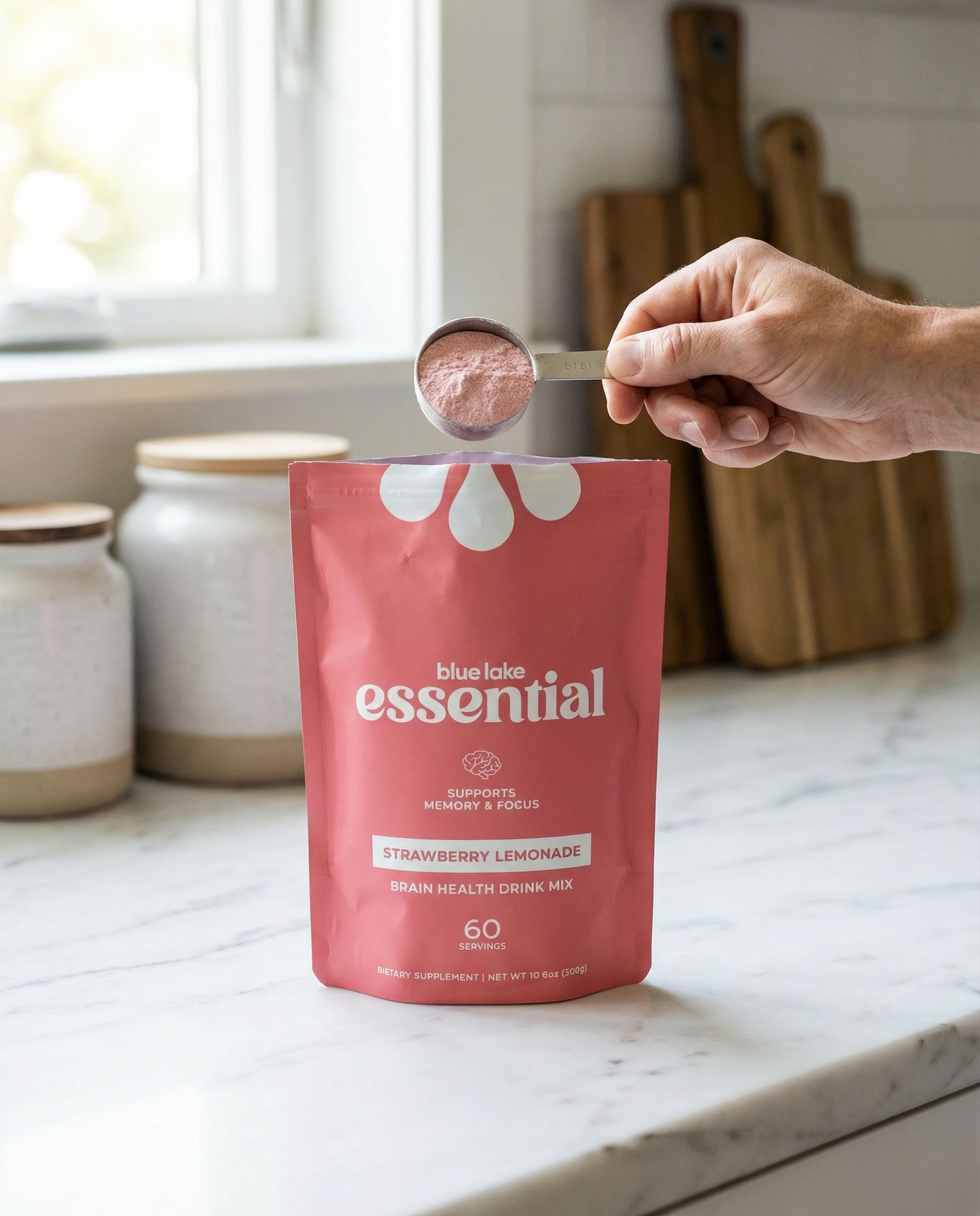
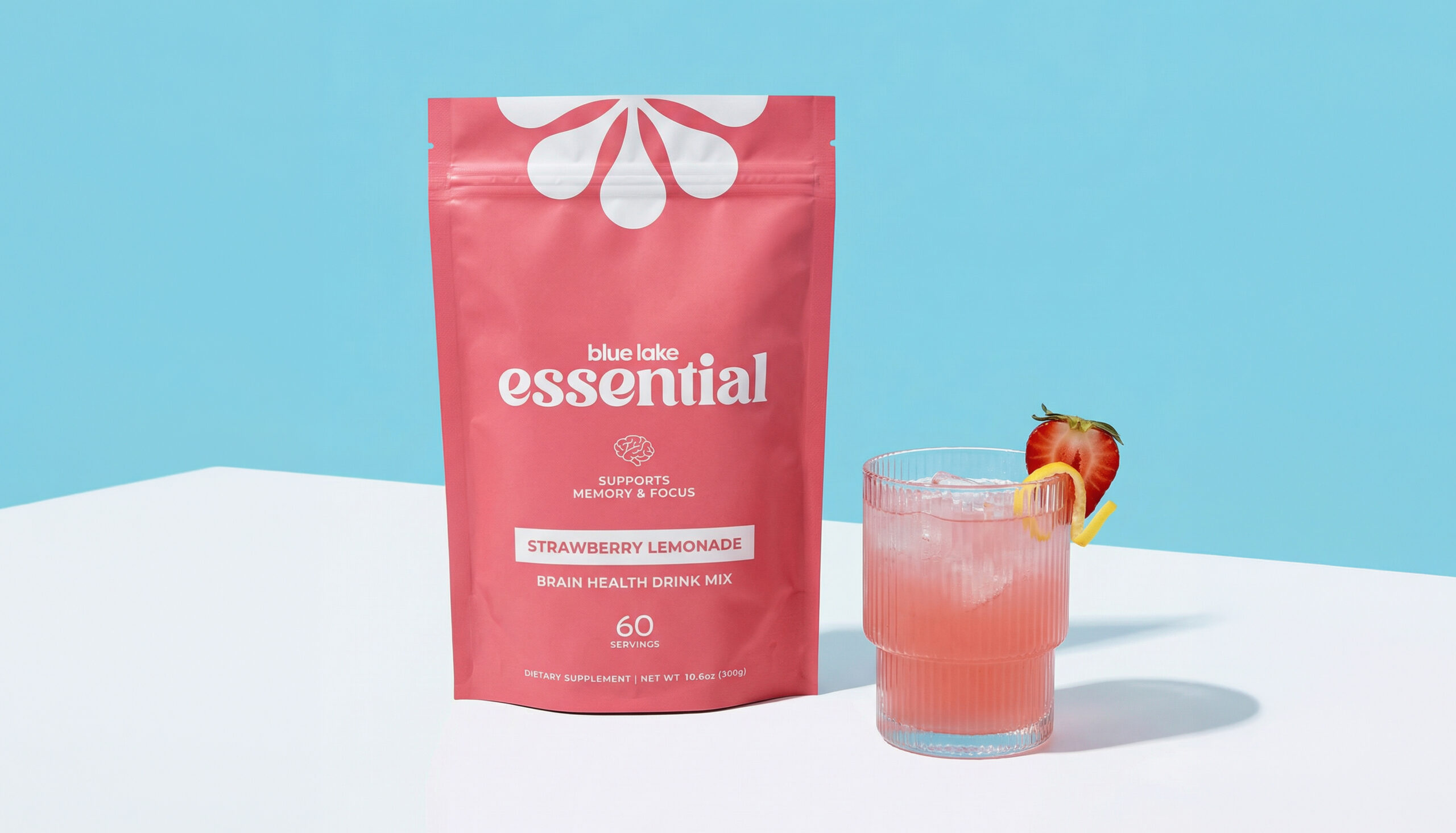
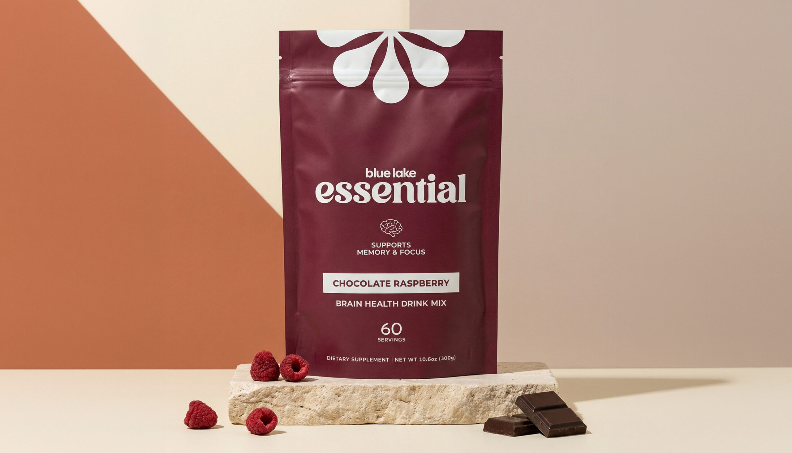
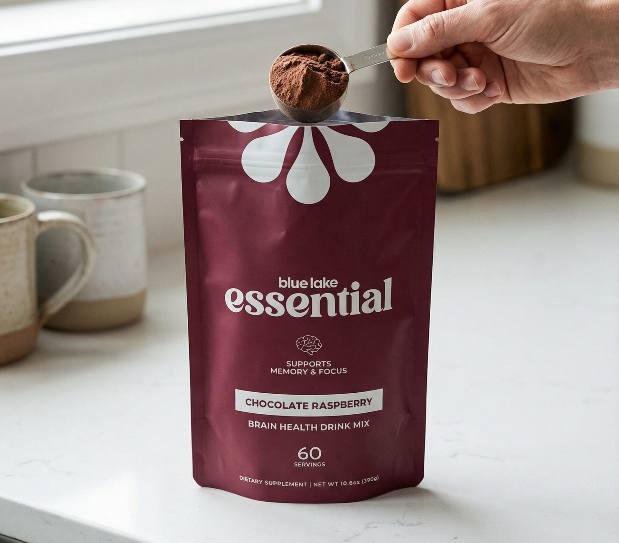
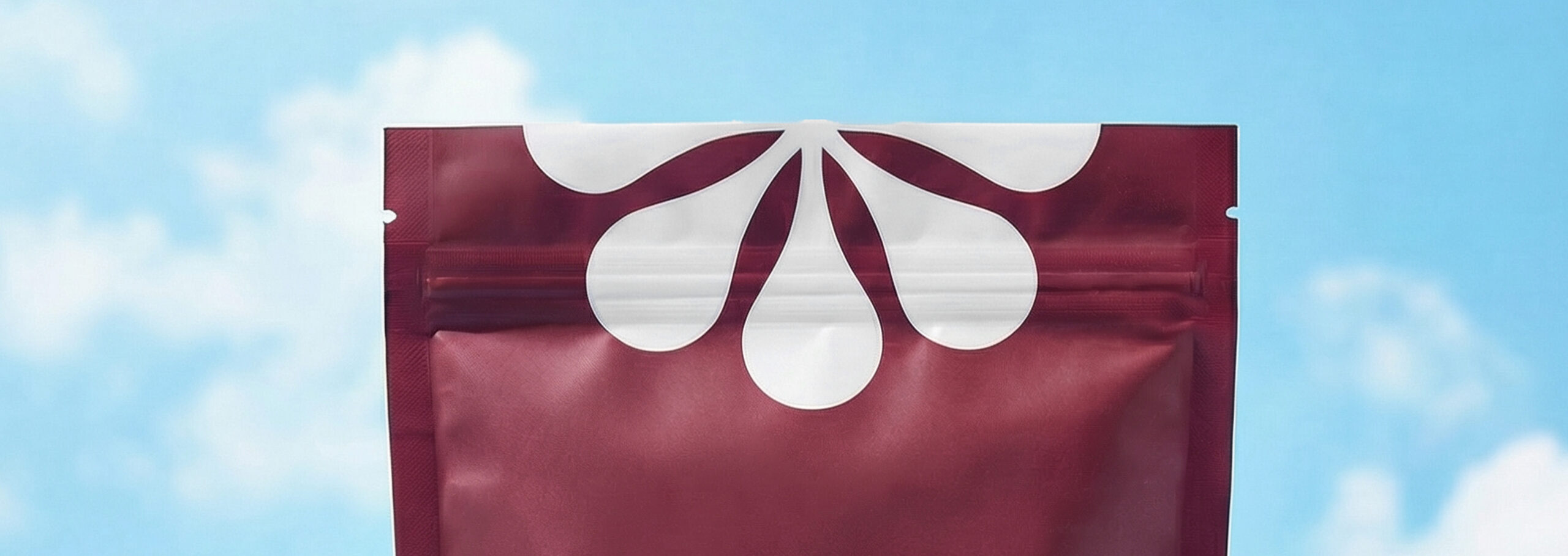
The direction centered on clarity, softness, and shelf appeal. I used bold typography, simple benefit messaging, flavor-led color palettes, and clean layouts to make the product feel modern, trustworthy, and easy to recognize in a consumer wellness space.