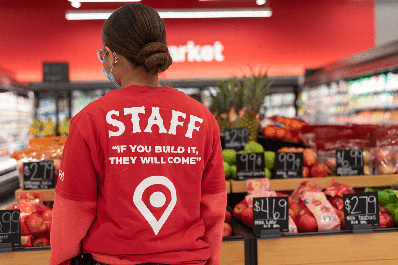
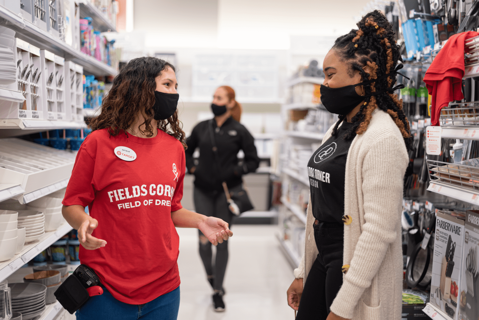
This was created specifically for the Boston Fields Corner Target, and I didn’t want it to feel like a generic store t-shirt that could belong anywhere. Fields Corner is not a “typical” place you’d expect to find a Target in Boston, so the goal was to make that the point, something that quietly celebrates the location and the community around it. The concept was a play off the movie Field of Dreams and the line “If you build it, they will come.” That idea felt perfect because the store is literally planted in a neighborhood where people might not expect it, but once it’s there, it becomes part of the everyday routine. From a design standpoint, I built the graphic around what already makes Target recognizable: the bullseye. I reimagined the bullseye as a baseball field because there’s one directly across from the store, which ties the “Field of Dreams” concept back to something real and local. I also wanted the shirt to slightly mirror a baseball jersey, not in a costume way, but in the sense of team energy. That connection made the design feel intentional, not forced, and gave the shirt a story employees could actually stand behind. To keep it clean and wearable, I used modern typography, strong hierarchy, and a clear front-and-back layout so it reads quickly and looks good on the body. The final shirt felt like Target, but also felt like Fields Corner, a simple uniform that doubled as a symbol of pride.