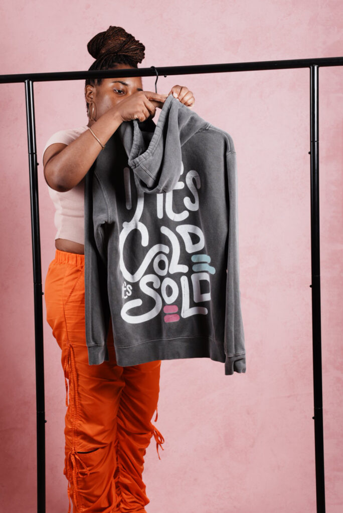
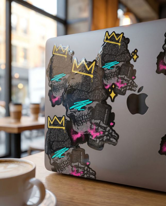
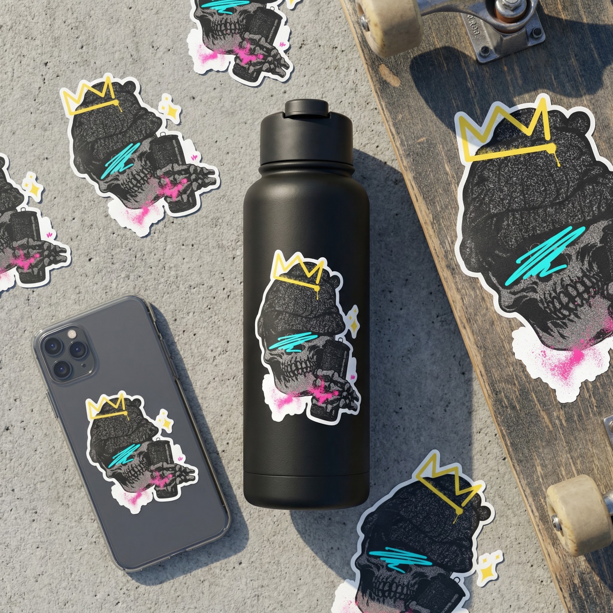
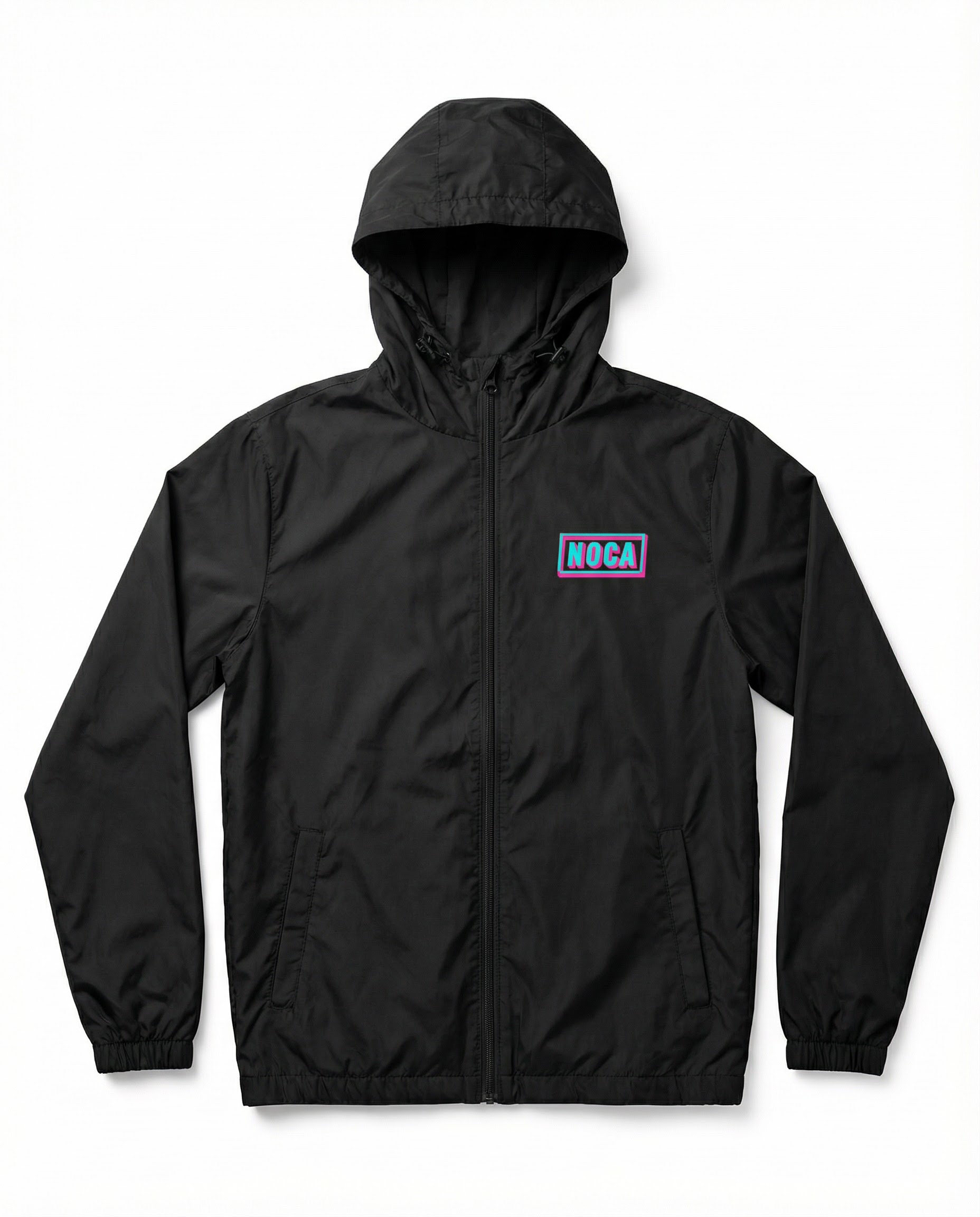
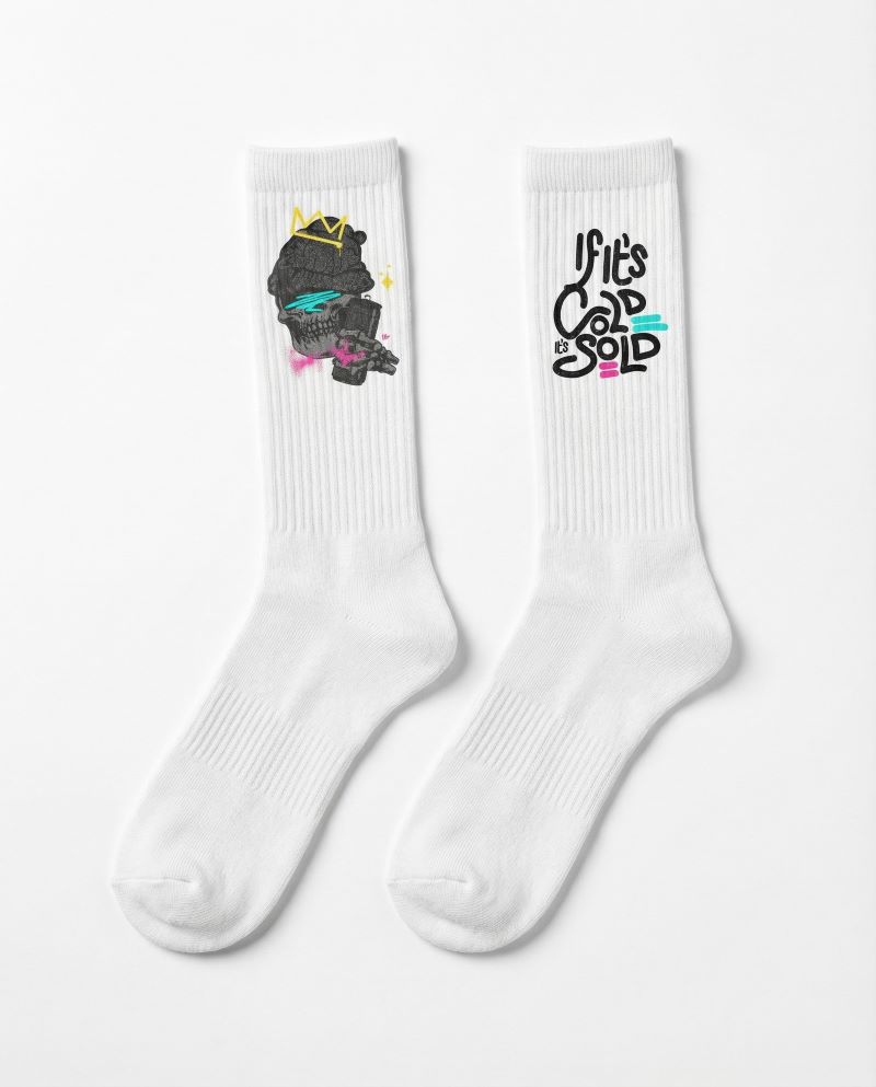
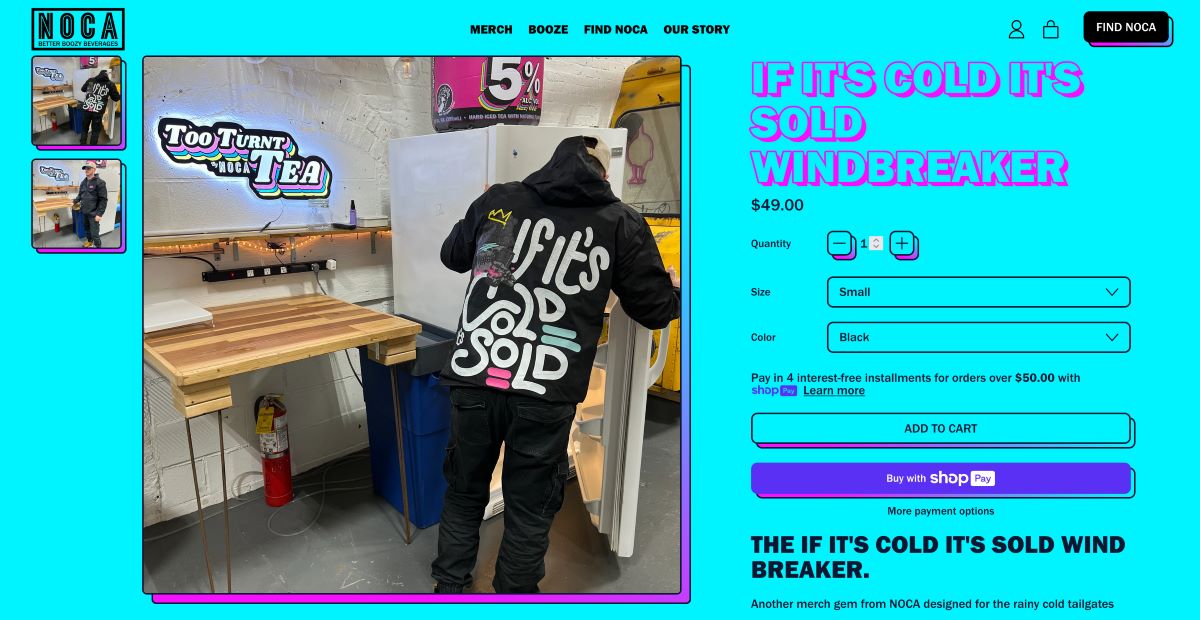
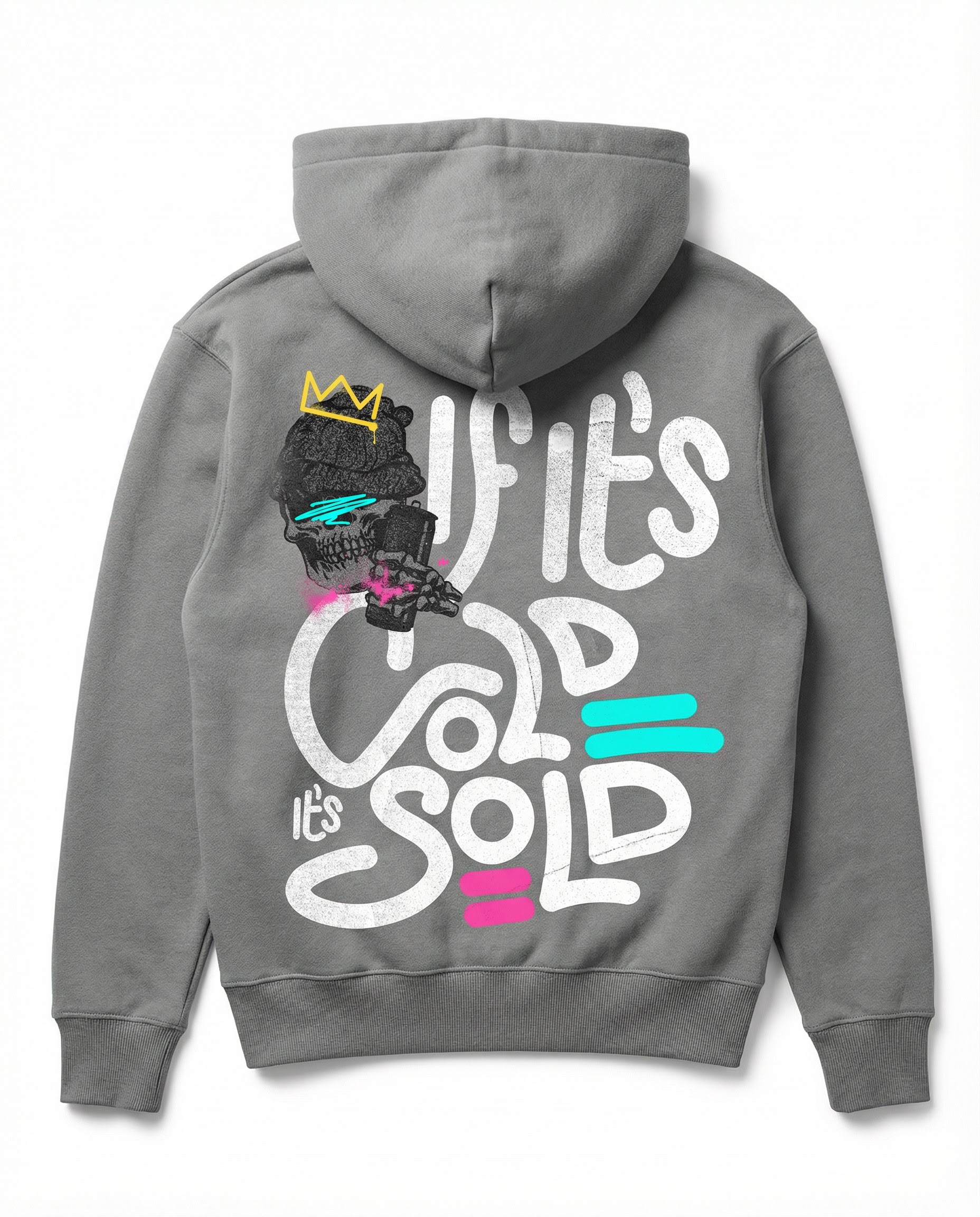
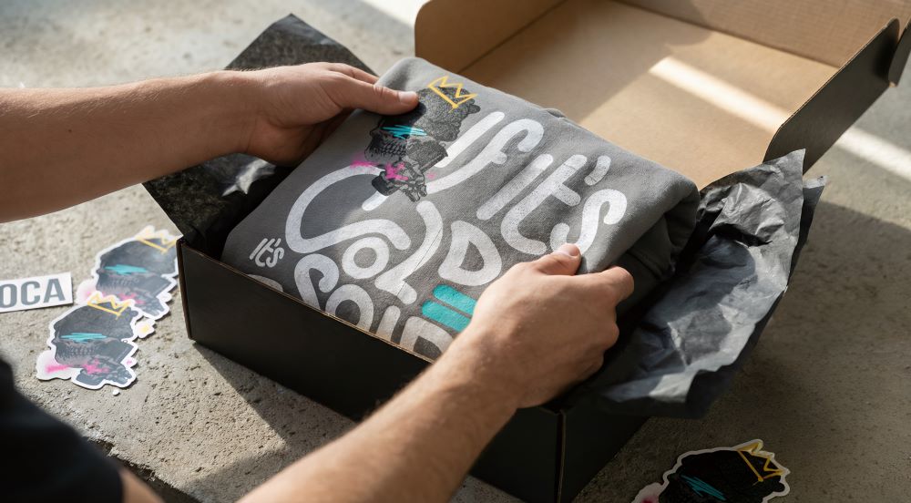
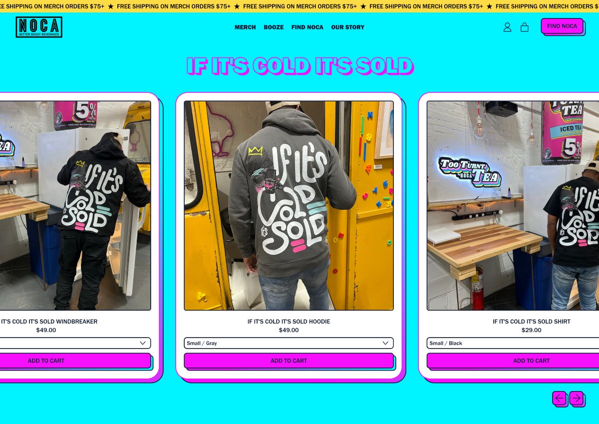
I started by translating the vibe into a clear design lane, what type styles, layout rules, and graphic treatments feel authentic to the world NOCA sits in. Then I explored multiple routes for the phrase, from clean statement type to more graphic-led compositions. To make it feel ownable, I created custom hand-drawn lettering so the final mark had personality and a lived-in feel, while staying readable and wearable. I refined the strongest direction, set a consistent system for future drops, and delivered production-ready artwork that could be applied across tees and other pieces without redesigning from scratch. The outcome was merch that looks like a real brand drop, not a logo slapped on a shirt.

