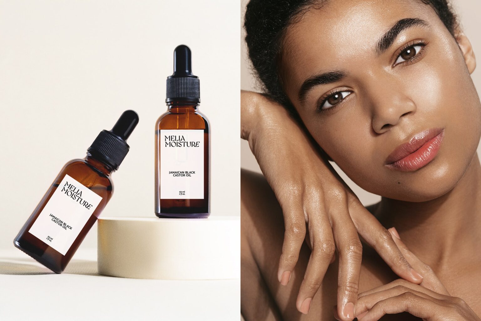
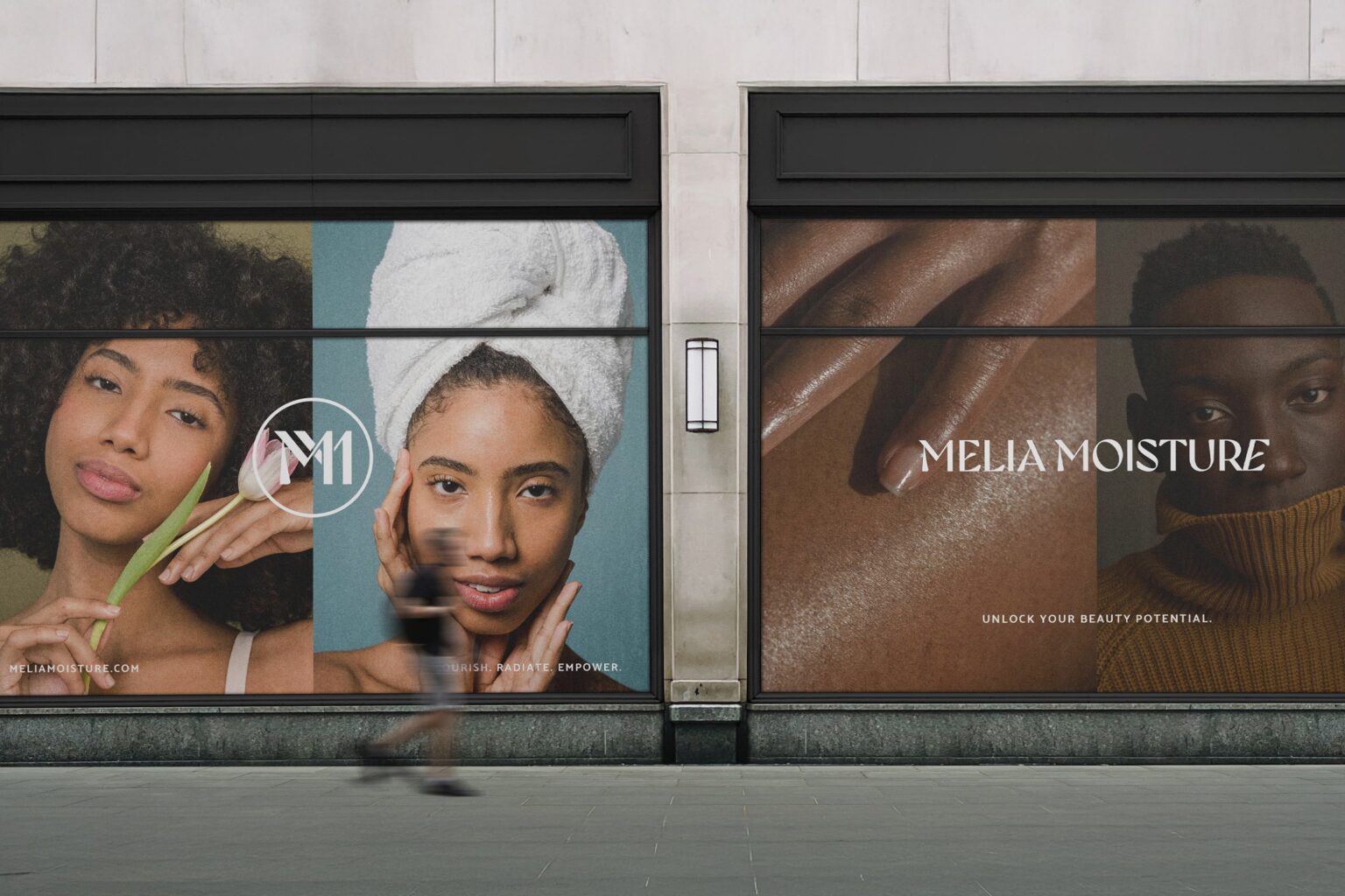
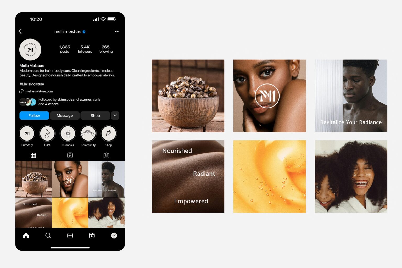
I started by defining the visual lane: luxury apothecary with warmth. From there, I built a brand system that balances premium typography with distinctive details so it feels recognizable, not stock. I designed a flexible logo family, including a primary wordmark, supporting lockups, and a stamp-style mark for more branded moments. Once the identity was set, I developed a grounded, neutral palette that keeps everything clean and elevated across print and digital. Then I applied the system to real touchpoints, packaging layouts that feel intentional and shelf-ready, plus social templates that keep the brand consistent while giving room for content variety. The result is a cohesive kit of parts Melia can grow with, without losing the look.